SYNERGIA
Synergia is an insurtech startup that aims to disrupt the traditional insurance industry by providing innovative and personalized insurance solutions. The company's mission is to make insurance accessible, easy, and affordable for everyone. Synergia's target audience is young professionals and families who value convenience, transparency, and flexibility. They are tech-savvy and expect seamless digital experiences from their service providers. The brand personality is dynamic, innovative, and customer-centric. The company is constantly evolving to meet the changing needs of its customers and the insurance industry. Synergia is approachable and friendly, with a focus on building trust and long-term relationships with its customers.
Synergia's visual identity is modern, dynamic, and approachable. The logo features a bold and modern typeface, with a bright color palette that represents innovation, accessibility, and approachability. The brand's imagery features real people in everyday situations, reflecting the company's focus on personalized and accessible insurance solutions. Overall, Synergia's brand identity is focused on innovation, simplicity, trust, and accessibility, with a modern and approachable visual identity and a simple and straightforward tagline.
Brand Identity Design - 2023
Created By - Ayooluwa Falaye
All rights reserved.

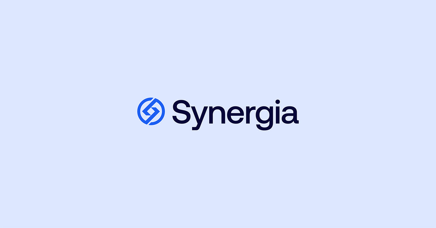
The Logo
The logo was carefully crafted with the intention of communicating our commitment to protecting our customers' valuable assets. The logo consists of a clean wordmark created by tweaking the typeface fused with a logomark which comprises of a circular shape that embodies the concept of unity and harmony, which is essential to the insurance industry. By combining the circular shape with the rhombus, we aimed to convey the message that our insurance firm provides comprehensive and holistic coverage to its customers, while maintaining a sense of balance and symmetry.


Typography and Colour Palette
General sans is the brand's official font which was meticulously modified to maintain the emblem's sleek, professional, and adaptable aesthetic. In addition, optical adjustments were made between the letters to establish visual harmony, resulting in a more appealing and effortless reading experience.
The brand's color palette was thoughtfully crafted based on extensive market research and aligned with the company's established positioning. The primary colors were chosen with a focus on the brand's identity and were augmented with shades of blue, evocative of natural beauty and a sense of calmness. Additionally, the color scheme was selected to communicate the firm's commitment to responsibility and dedication.
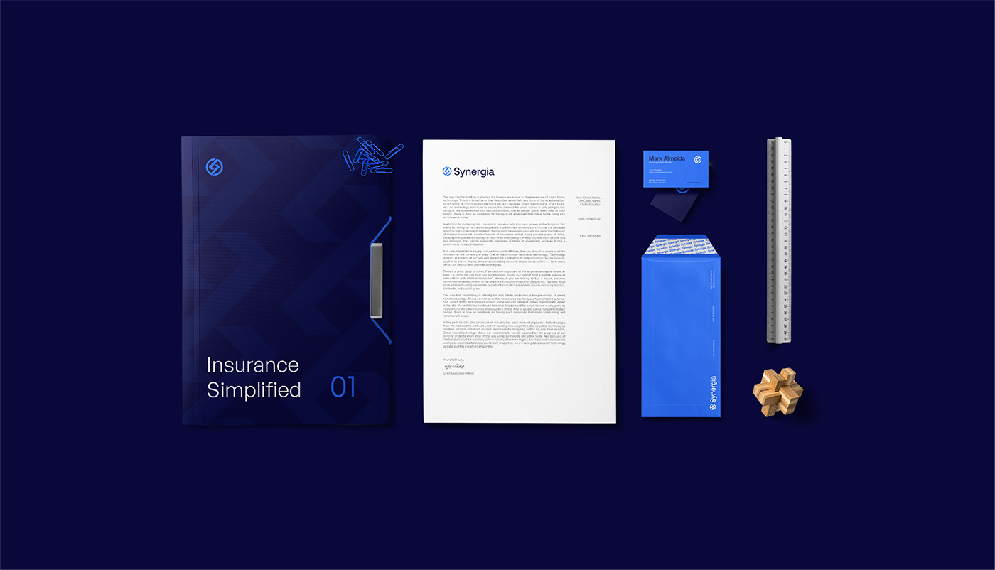
Brand Application
This is the implementation of the brand's new identity across all brand assets, including corporate materials such as letterheads and business cards, as well as marketing materials like banners, posters, and other touchpoints with clients, represents a noteworthy advancement towards enabling customers to perceive the brand as a coherent entity. By adopting a consistent brand voice and appearance, the brand can establish more effective communication with its clientele.